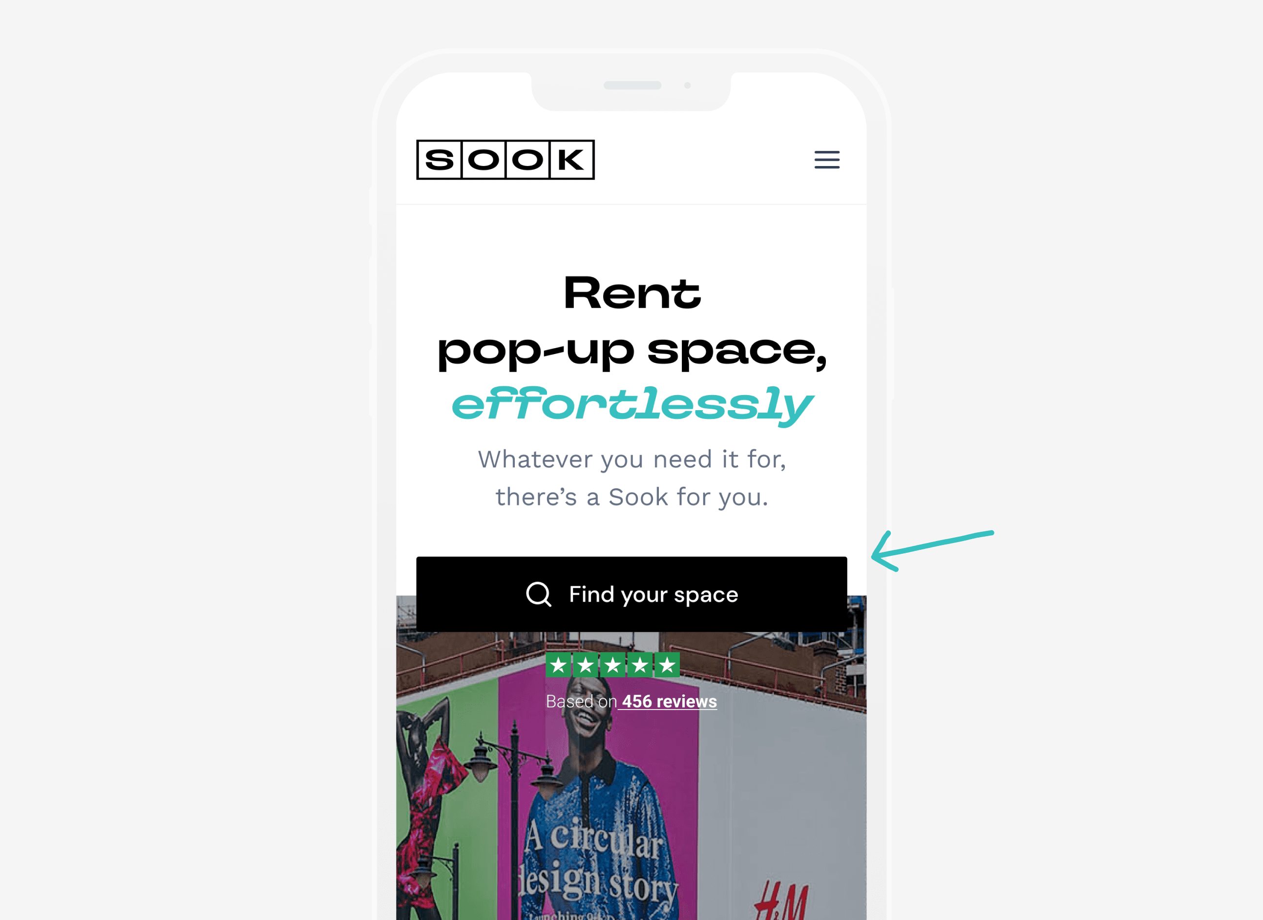
Sook spaces
Fully flexible, digitally-powered pop-up spaces.
PRODUCT DESIGN
*
digital transformation

* 01 / Project Overview
Sook spaces offers fully flexible short-term commercial rental spaces, powered by a digital-first experience that aims to disrupt the market. After an initial competitor analysis, we were clear on the potential for Sook to own the space by leveraging technology, user experience and marketing.
my role
Responsible for research, conceptualisation, design, user testing and delivery.
the team
1 designer, 1 product manager 1 CPO and 4 engineers.
timeline
4 months
The impact
The work done during the first 2 months of our engagement not only secured big clients for Polyloop but also led to

* 02 / Problem statement
Their site was originally designed for small businesses. Hence the experience started breaking when scaled to handle large volumes and complex workflows across different industries and business needs. How might we empower Sook employees to provide exceptional customer service, while making it simple, delightful and uncomplicated for end users to navigate through.
* 03 / Process
We kicked off the process with a comprehensive round of stakeholder interviews to quickly become experts in their industry and understand what success would look like for the business.
To understand the existing user experience, we talked to internal stakeholders, did a UX audit of the existing website, conducted user interviews, and completed competitor research.
With all the research completed, as a team we began ideating, doing quick hand-drawn sketches. These were developed into high-fidelity screens and prototypes. I worked in parallel with the engineers, insuring all designs were feasible and user-centric.
With the flows built, we gathered feedback from existing customers, aiming to optimise the design.

Breaking down the problem
The initial website faced several challenges, including a high bounce rate, low conversion rates, and a lack of intuitive user experience. The company's primary goals were to:
1
Increase conversion to stay afloat
The website needed to convert visitors into renters, increasing the number of bookings made.
2
Enhance user experience
The existing user interface was outdated and confusing, making it difficult for visitors to navigate and find relevant information.
3
Optimize mobile experience
With a growing number of users accessing the website via mobile devices, it was crucial to ensure a seamless experience across different screen sizes.
4
Tidy up internal processes
Sales and customer service teams relied on time-consuming manual processes prompting human mistakes and being too far from their "digital-first" vision.
The users
We conducted user interviews with existing Sook customers along with potential and undecided users. Our main goal from the interviews was to understand their experience of Sook, including booking and in-store, and the factors they considered when choosing a space to rent.
SCROLL TO YOUR RIGHT
Connect to Content
Add layers or components to make infinite auto-playing slideshows.
Design goals
The experience review also helped us define our focus areas for the redesign.
key takeaways
(Details)
Messy UX
Several user flows and experiences in the existing product scored very low as per our benchmarking.
Lack of clear value proposition
Time spent on task (measured during our testing phase and historically from GA) was unsatisfactorily high, users weren't clear on the basics, or the process.
Simple
Clean out the clutter, and help users easily complete their tasks.
Coherent
Focusing on user jobs and workflows rather than silos of information.
Flexible
Bookings should seamlessly adapt to variable levels of business/industry complexity.
Identifying and prioritising user jobs.
A comprehensive list of user jobs across personas were framed and stack ranked. This exercise laid the foundation for our first iteration.
An example of a jobs-to-be-done for Sook to capture user jobs and needs.
Enrolling our triad into our design workshops worked out wonderfully as our engineers and myself came with deep knowledge about the current business limitations. This gave us diverse & comprehensive perspectives as we charted out a plan for our first line of action.
Actor
As an organiser
Situation
When I need to set up a pop-up space
Motivation
I want to know the availability of the spaces around
Outcome
so that I can start planning along.
Connect to Content
Add layers or components to infinitely loop on your page.
Streamlining the golden task
USER SCENARIO
All user types showed frustration with the no. of screens needed before getting to perform their main task/goal, specially returning customers.
SOLUTION
Users are now served with a CTA shortcut to perform the golden task of the site. A series of experiments helped consolidate final copy both for the CTA and the hero. A 24% increase CR was recorded on the first month, along with a 35% increase in traffic for the product pages.
Bringing the product to the front
USER SCENARIO
The design of the product cards was perceived as overwhelming and often missed on scroll. 80% of users relied on the navigation bar to explore the product offer for the first time.
SOLUTION
Making use of modern usability patterns helped establish the principle of familiarity around the site bringing clarity and easing discovery plus conversion.

Simpler, clearer booking funnel
USER SCENARIO
The design of the product cards was perceived as overwhelming and often missed on scroll. 80% of users relied on the navigation bar to explore the product offer for the first time.
SOLUTION
Making use of modern usability patterns helped establish the principle of familiarity around the site bringing clarity and easing discovery plus conversion.

* 04 / Solution
Final outcome
Each highlight captures an aspect of the new Sook experience. It calls out which design goal it adheres to, what user scenario or problem its solving and what the solution is.
Want to know more?
Book an interview with me to get extended
insights and my personal view.
* 05/ Learnings
Taking notes for the future.
With retail taking a big hit during and after the COVID-19 pandemic, Sook and many others in the space were navigating through high levels of uncertainty still. This amongst other factors limited our capacity to act as vehicles of change and position the client even further in the industry.
Sook spaces
Fully flexible, digitally-powered pop-up spaces.
PRODUCT DESIGN
*
digital transformation
* 01 / Project Overview
Sook spaces offers fully flexible short-term commercial rental spaces, powered by a digital-first experience that aims to disrupt the market. After an initial competitor analysis, we were clear on the potential for Sook to own the space by leveraging technology, user experience and marketing.
my role
Responsible for research, conceptualisation, design, user testing and delivery.
the team
1 designer, 1 product manager 1 CPO and 4 engineers.
timeline
4 months
The impact
The work done during the first 2 months of our engagement not only secured big clients for Polyloop but also led to
* 02 / Problem statement
Their site was originally designed for small businesses. Hence the experience started breaking when scaled to handle large volumes and complex workflows across different industries and business needs. How might we empower Sook employees to provide exceptional customer service, while making it simple, delightful and uncomplicated for end users to navigate through.
Breaking down the problem
The initial website faced several challenges, including a high bounce rate, low conversion rates, and a lack of intuitive user experience. The company's primary goals were to:
1
Increase conversion to stay afloat
The website needed to convert visitors into renters, increasing the number of bookings made.
2
Enhance user experience
The existing user interface was outdated and confusing, making it difficult for visitors to navigate and find relevant information.
3
Optimize mobile experience
With a growing number of users accessing the website via mobile devices, it was crucial to ensure a seamless experience across different screen sizes.
4
Tidy up internal processes
Sales and customer service teams relied on time-consuming manual processes prompting human mistakes and being too far from their "digital-first" vision.
* 03 / Process
We kicked off the process with a comprehensive round of stakeholder interviews to quickly become experts in their industry and understand what success would look like for the business.
To understand the existing user experience, we talked to internal stakeholders, did a UX audit of the existing website, conducted user interviews, and completed competitor research.
With all the research completed, as a team we began ideating, doing quick hand-drawn sketches. These were developed into high-fidelity screens and prototypes. I worked in parallel with the engineers, insuring all designs were feasible and user-centric.
With the flows built, we gathered feedback from existing customers, aiming to optimise the design.
To understand the existing user experience, we talked to internal stakeholders, did a UX audit of the existing website, conducted user interviews, and completed competitor research.
With all the research completed, as a team we began ideating, doing quick hand-drawn sketches. These were developed into high-fidelity screens and prototypes. I worked in parallel with the engineers, insuring all designs were feasible and user-centric.
With the flows built, we gathered feedback from existing customers, aiming to optimise the design.
To understand the existing user experience, we talked to internal stakeholders, did a UX audit of the existing website, conducted user interviews, and completed competitor research.
With all the research completed, as a team we began ideating, doing quick hand-drawn sketches. These were developed into high-fidelity screens and prototypes. I worked in parallel with the engineers, insuring all designs were feasible and user-centric.
With the flows built, we gathered feedback from existing customers, aiming to optimise the design.
The users
We conducted user interviews with existing Sook customers along with potential and undecided users. Our main goal from the interviews was to understand their experience of Sook, including booking and in-store, and the factors they considered when choosing a space to rent.
Connect to Content
Add layers or components to make infinite auto-playing slideshows.
Design goals
The experience review also helped us define our focus areas for the redesign.
key takeaways
Messy UX
Several user flows and experiences in the existing product scored very low as per our benchmarking.
Lack of clear value proposition
Time spent on task (measured during our testing phase and historically from GA) was unsatisfactorily high, users weren't clear on the basics, or the process.
Simple
Clean out the clutter, and help users easily complete their tasks.
Coherent
Focusing on user jobs and workflows rather than silos of information.
Flexible
Bookings should seamlessly adapt to variable levels of business/industry complexity.
Identifying and prioritising user jobs.
A comprehensive list of user jobs across personas were framed and stack ranked. This exercise laid the foundation for our first iteration.
An example of a jobs-to-be-done for Sook to capture user jobs and needs.
Enrolling our triad into our design workshops worked out wonderfully as our engineers and myself came with deep knowledge about the current business limitations. This gave us diverse & comprehensive perspectives as we charted out a plan for our first line of action.
Actor
As an organiser
Situation
When I need to set up a pop-up space
Motivation
I want to know the availability of the spaces around
Outcome
so that I can start planning along.
* 04 / Solution
Final outcome
Each highlight captures an aspect of the new Sook experience. It calls out which design goal it adheres to, what user scenario or problem its solving and what the solution is.
Streamlining the golden task
USER SCENARIO
All user types showed frustration with the no. of screens needed before getting to perform their main task/goal, specially returning customers.
SOLUTION
Users are now served with a CTA shortcut to perform the golden task of the site. A series of experiments helped consolidate final copy both for the CTA and the hero. A 24% increase CR was recorded on the first month, along with a 35% increase in traffic for the product pages.
Bringing the product to the front
USER SCENARIO
The design of the product cards was perceived as overwhelming and often missed on scroll. 80% of users relied on the navigation bar to explore the product offer for the first time.
SOLUTION
Making use of modern usability patterns helped establish the principle of familiarity around the site bringing clarity and easing discovery plus conversion.
Simpler, clearer booking funnel
USER SCENARIO
The design of the product cards was perceived as overwhelming and often missed on scroll. 80% of users relied on the navigation bar to explore the product offer for the first time.
SOLUTION
Making use of modern usability patterns helped establish the principle of familiarity around the site bringing clarity and easing discovery plus conversion.
Connect to Content
Add layers or components to infinitely loop on your page.
* 05/ Learnings
Taking notes for the future.
With retail taking a big hit during and after the COVID-19 pandemic, Sook and many others in the space were navigating through high levels of uncertainty still. This amongst other factors limited our capacity to act as vehicles of change and position the client even further in the industry.
Want to know more?
Book an interview with me to get extended
insights and my personal view.